Resene shifts design advice from rustic brick to deep wine tones
Color experts advise pairing rich burgundies with warm neutrals and muted blues to balance light absorption in residential interiors.
By Aisha Saeed ·
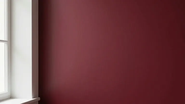
Resene color consultant Meryl Southey says interior design has moved away from flat, one-note rusts toward shades with more nuance and depth. The brand now promotes a spectrum of wine and berry reds, including burgundies, plums, and moody red-toned purples. This shift replaces the rustic, brick-toned reds that defined warmth in home design for years.
The new palette includes specific shades from the Resene Multi Finish range. Options range from the deep plum of Resene Rustic Red to the classic burgundy of Merlot. The collection also features mid-toned Vanquish and the moodier, garnet-like Cab Sav. Southey notes that these colors bring drama to a room when paired thoughtfully within a considered palette.
South-facing rooms tend to suit warmer-toned reds, while naturally warm rooms can carry cooler-toned reds without feeling overheated. Painters must consider natural light when selecting a shade. A red that sings in one room may feel wrong in another due to differences in ambient temperature and sunlight exposure.
Wine and berry reds suit quiet spaces such as bedrooms, dining rooms, and sitting rooms. These colors provide cocooning warmth without needing to cover every surface. A single feature wall, a door, or a piece of furniture painted in a deep wine shade delivers visual weight. This approach allows homeowners to test their appetite for rich colors before committing to a full room.
For those ready for a larger commitment, color drenching a guest bedroom, powder room, or media room creates a deliberate surprise. Resene Mulberry is suggested for this technique. It can be freshened with notes of Dutch White and a touch of spiced green Pacifica. Repeating a touch of the same red on a stool, bookshelf, or wardrobe door connects the drenched room to the rest of the house.
Floors and ceilings offer underused options for these tones. A two-tone checkerboard floor using Resene Walk-On tinted to a rich pinot-like red such as Pohutukawa works well alongside a soft greyed white like White Pointer. This combination creates a modern take on a traditional pattern. The specific pairing depends on the desired level of contrast and visual rhythm in the space.
Deep saturated reds absorb light rather than reflect it. Painting a whole room in a dim area with a deep red can make the space feel oppressive. Southey advises two solutions to maintain cosiness without darkness. Homeowners can soften the color itself by using a half, quarter, or eighth tint of the same shade. For example, using Half Merlot instead of full strength Merlot reflects more light and feels less heavy in a dim room.
Alternatively, homeowners can keep the color full strength but use less of it. Saving the intense version for a smaller, contained area like a feature wall or cabinetry prevents the color from absorbing light across the entire room. Full strength Resene Aroha or Upstage works well on a feature wall or painted cabinet in a darker room. A stand-alone guest toilet is another space where embracing the dark nature of enclosed reds works well.
Sheen level affects how deep purple-hued reds look and feel. A velvety low sheen or flat finish, such as Resene SpaceCote Low Sheen or Resene SpaceCote Flat, enhances richness and gives colors a suede-like quality. Higher gloss levels intensify the color and reflect a little more light. Southey identifies pairing rich reds with dusty blues and muted greens as a strong emerging trend that softens formality.
Specific pairings recommended by Resene include Aroha with Duck Egg Blue, Staccato with Sea Fog, and Upstage with Paddock and Half Tea. Other combinations involve Toledo and Norway with Quarter Fossil, or Hukanui with Dusted Blue and Quarter Merino. Southey describes Resene Aroha as a gorgeous statement burgundy and Hukanui as a softer, muddier burgundy that is very current. Upstage is a deep luxurious plum with enough warmth to feel inviting rather than gothic, while Staccato is a beautiful smoky aubergine that is very contemporary and Toledo an earthy plum-brown for a cosy interior.
Source: The Star